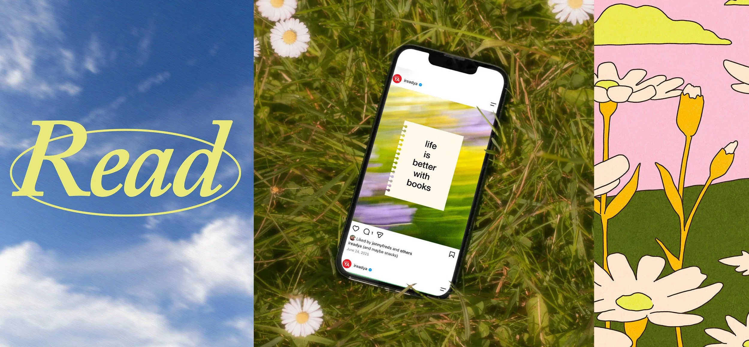
I Read YA: Social Media Identity
Creative Direction · Visual Identity · Photo Art Direction
Social Media · Brand Identity
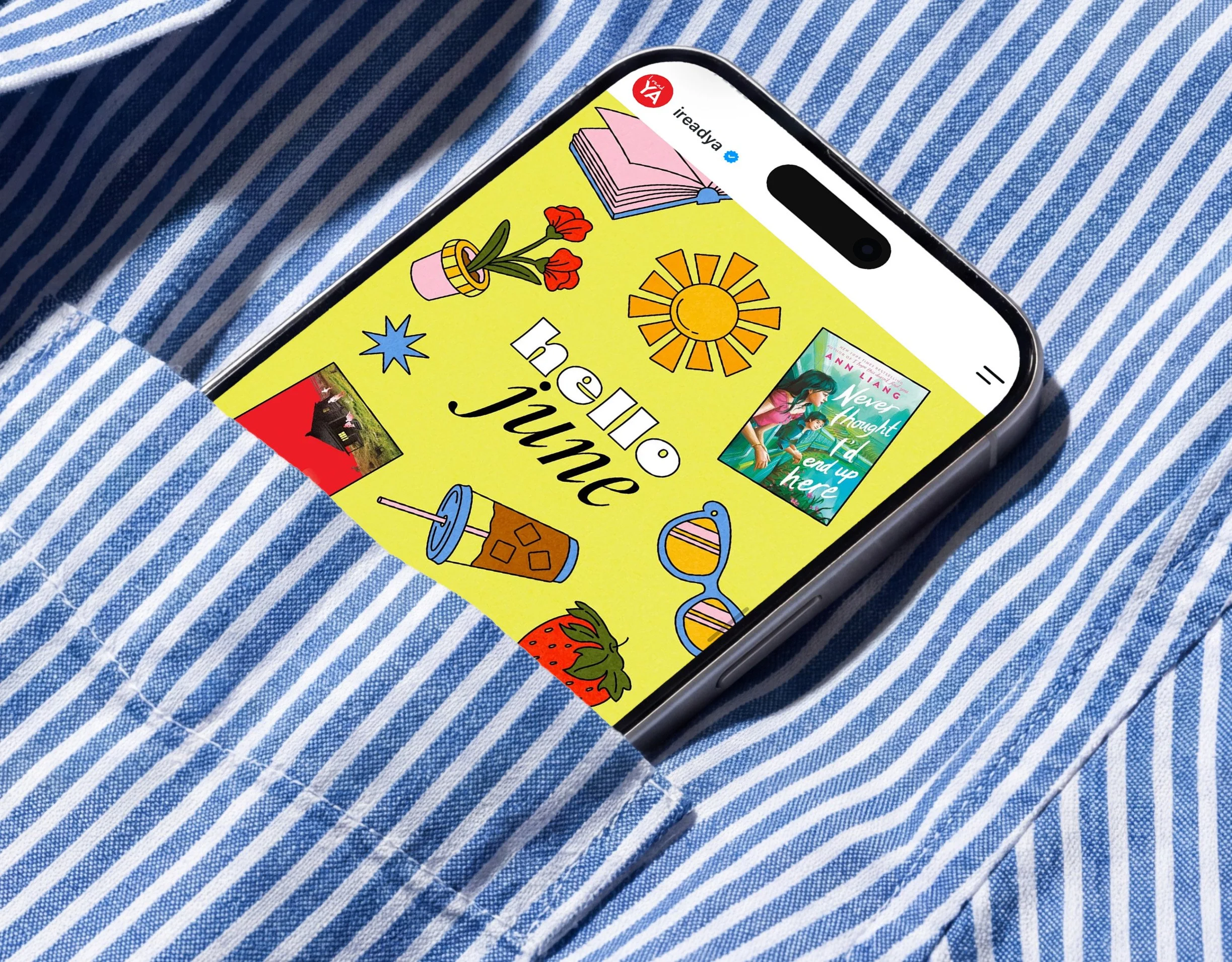
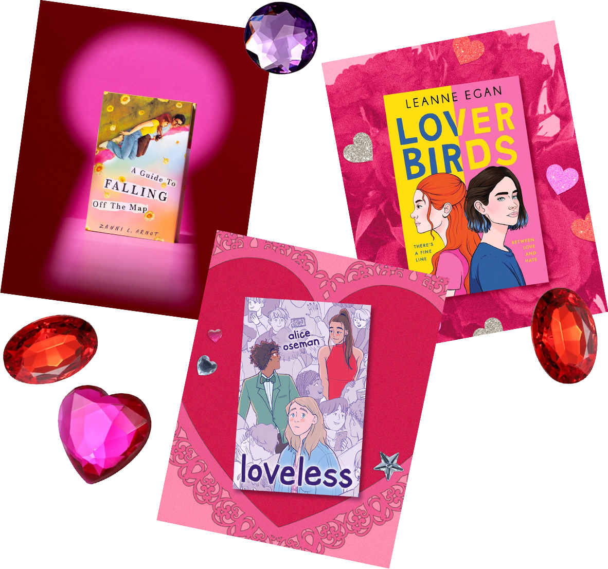
I Read YA is Scholastic’s social community for readers and fans of Young Adult fiction. To better connect with its audience, I led a refresh of the channel’s visual identity, creating a flexible design system spanning illustration, photography, typography, color, and recurring content franchises.
Built around the idea of the “cool nerd,” the new identity combines the nostalgia of classic book culture with a fresh, contemporary sensibility. The system was designed to flex across titles, genres, seasons, and campaigns while giving I Read YA a distinct and recognizable point of view. Following the refresh, the channel saw increased engagement and click-through rates across social content.
Created with designer and illustrator Rose Schisler and photographer Josh Loring.
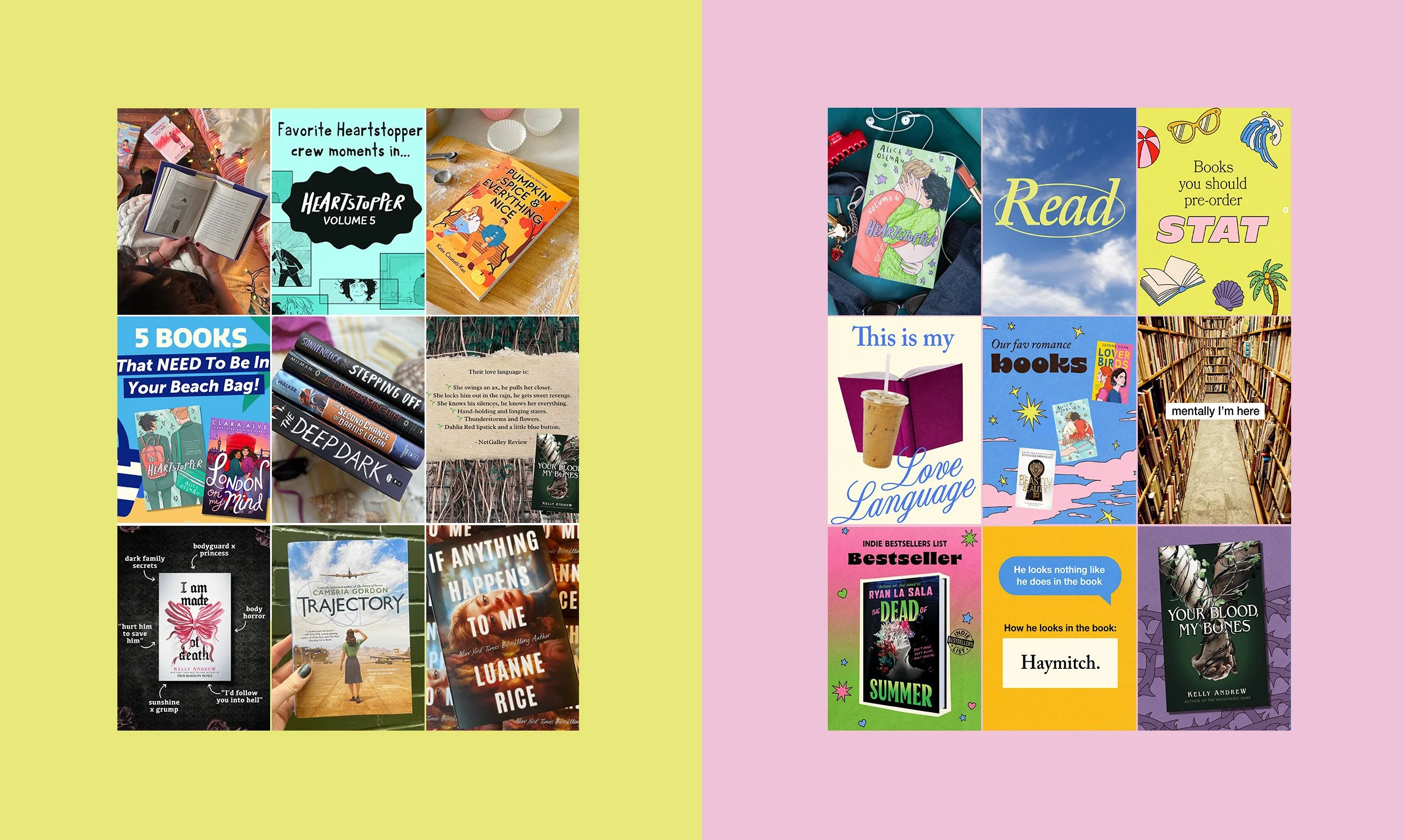
Before and After
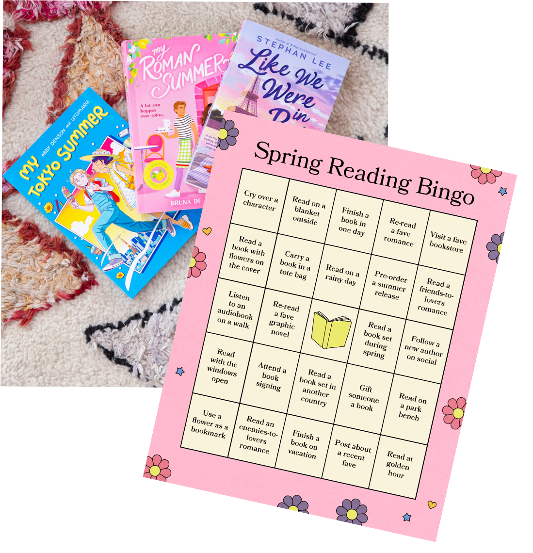
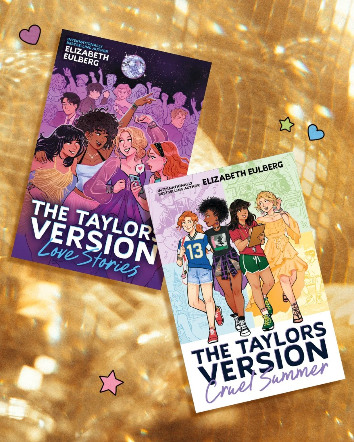
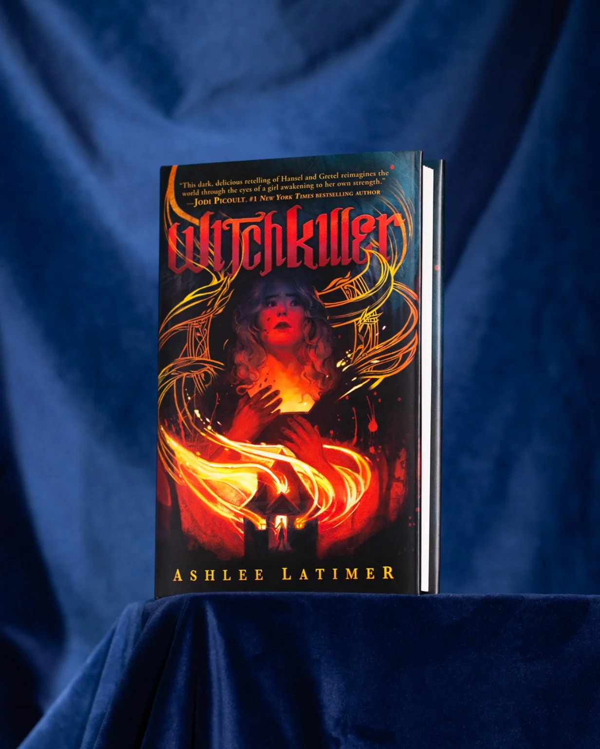
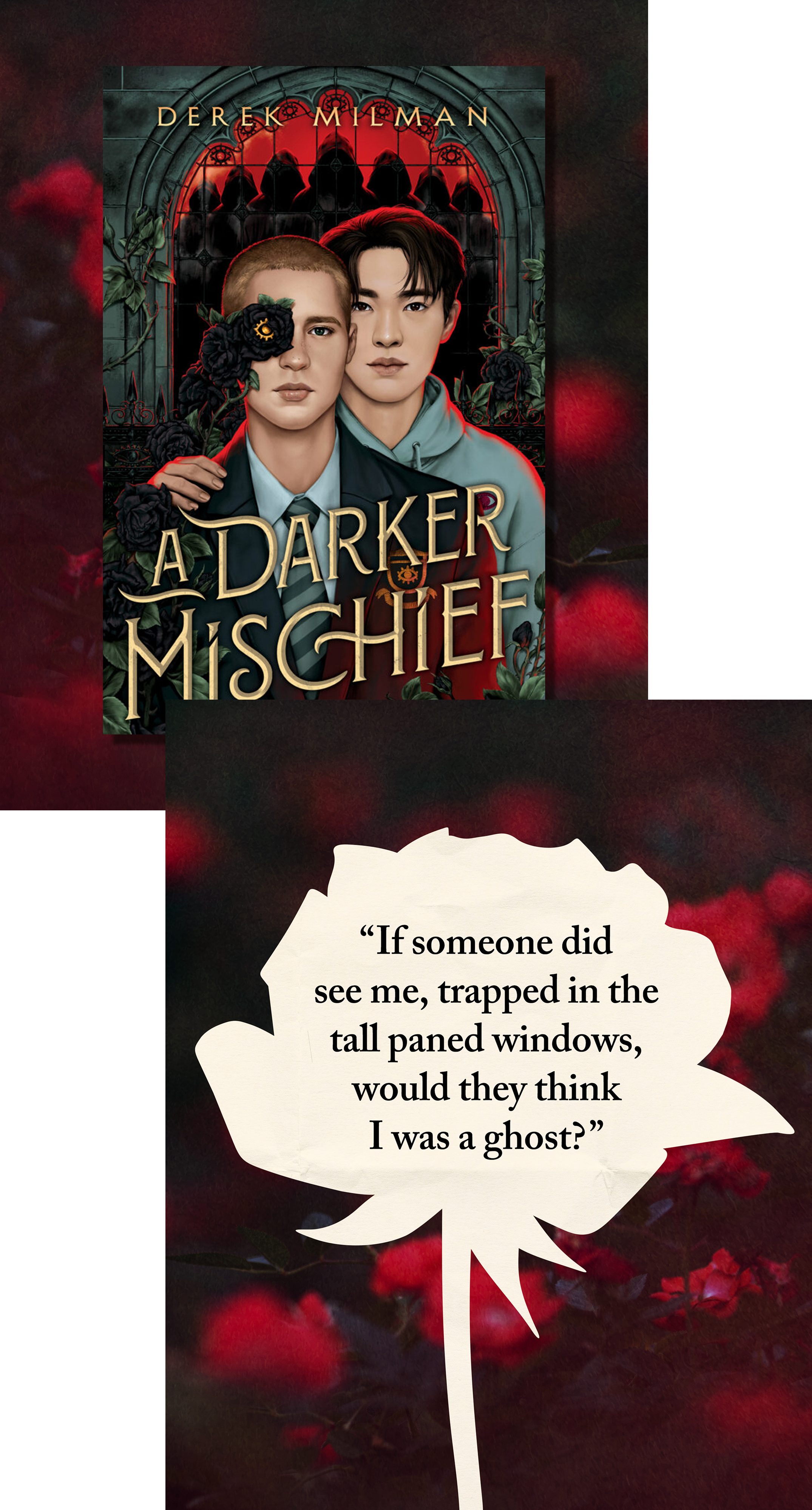
A more cohesive visual system transformed the feed from a collection of individual posts into a recognizable editorial identity.
Concept
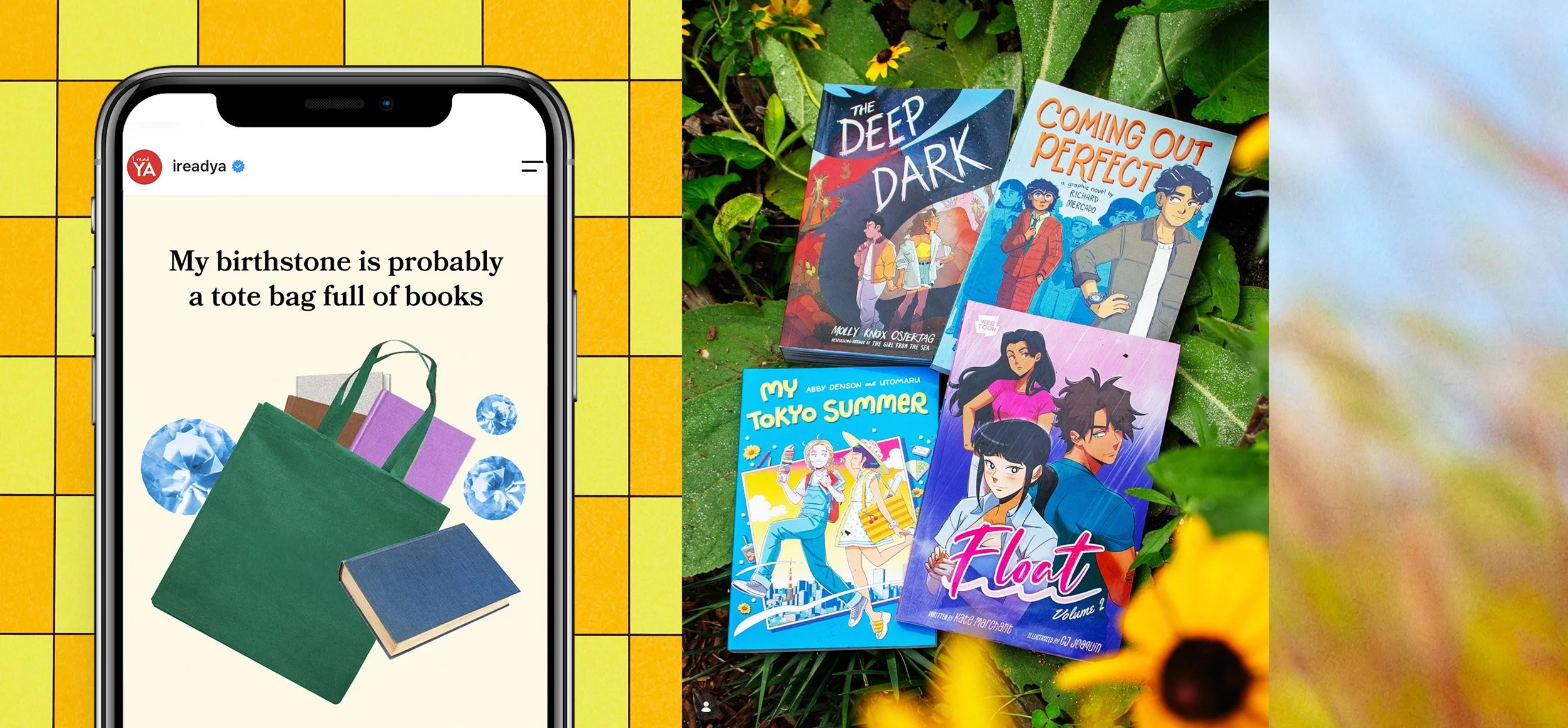
We began by defining the I Read YA audience through a simple persona: the “cool nerd”—curious, creative, culturally engaged, and unapologetically obsessed with books. I led working sessions with the marketing team to translate that personality into a visual world that could feel youthful without feeling juvenile.
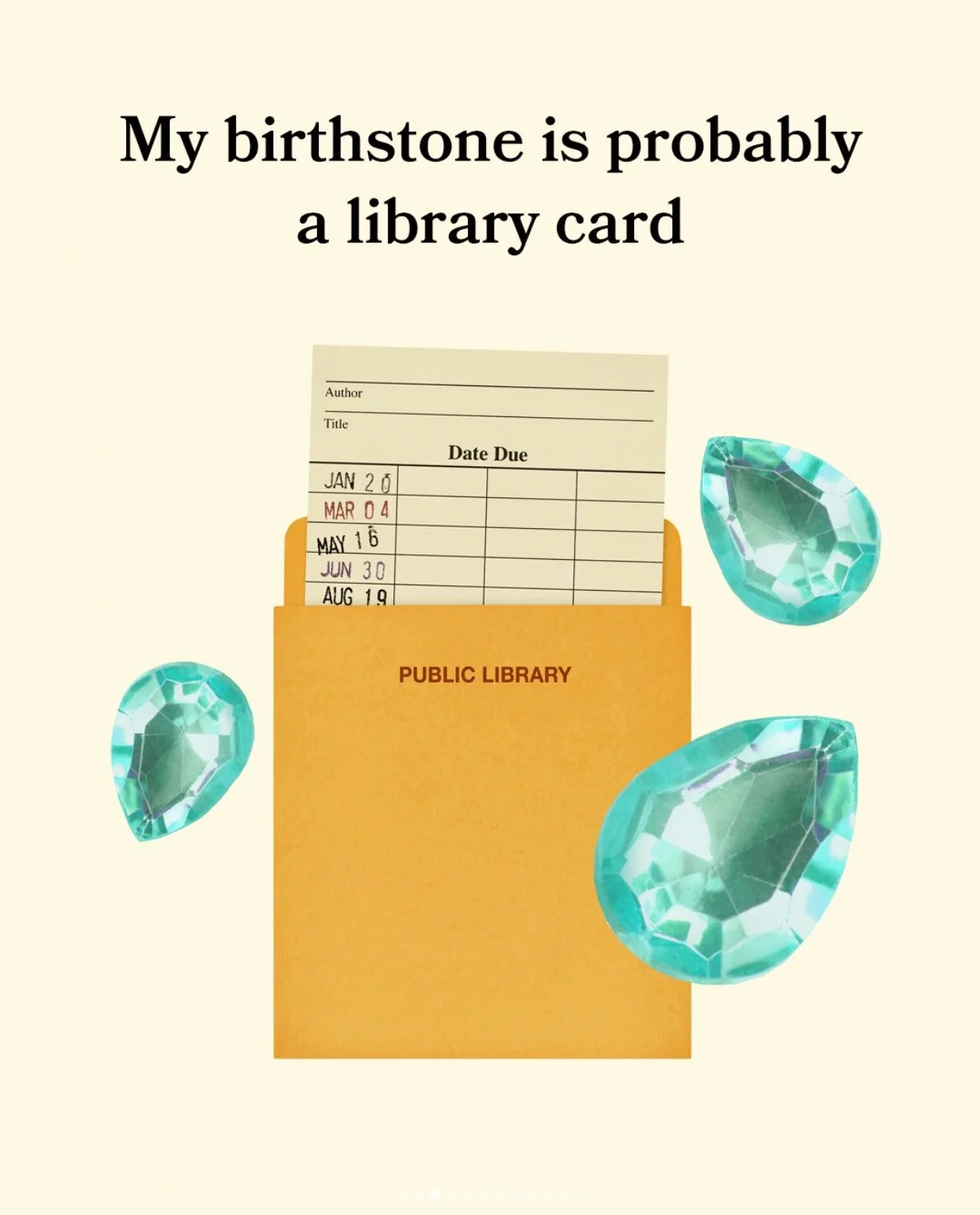
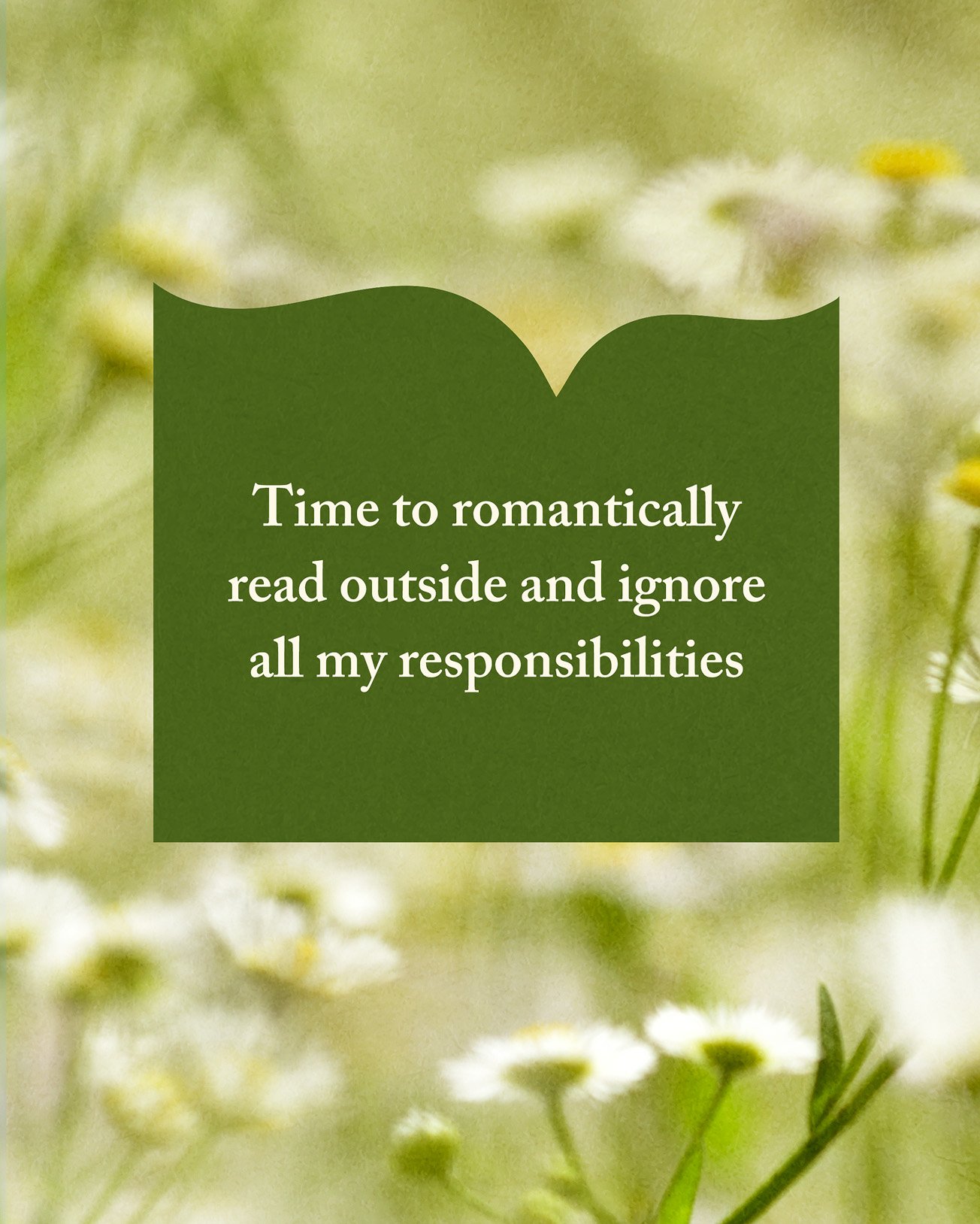
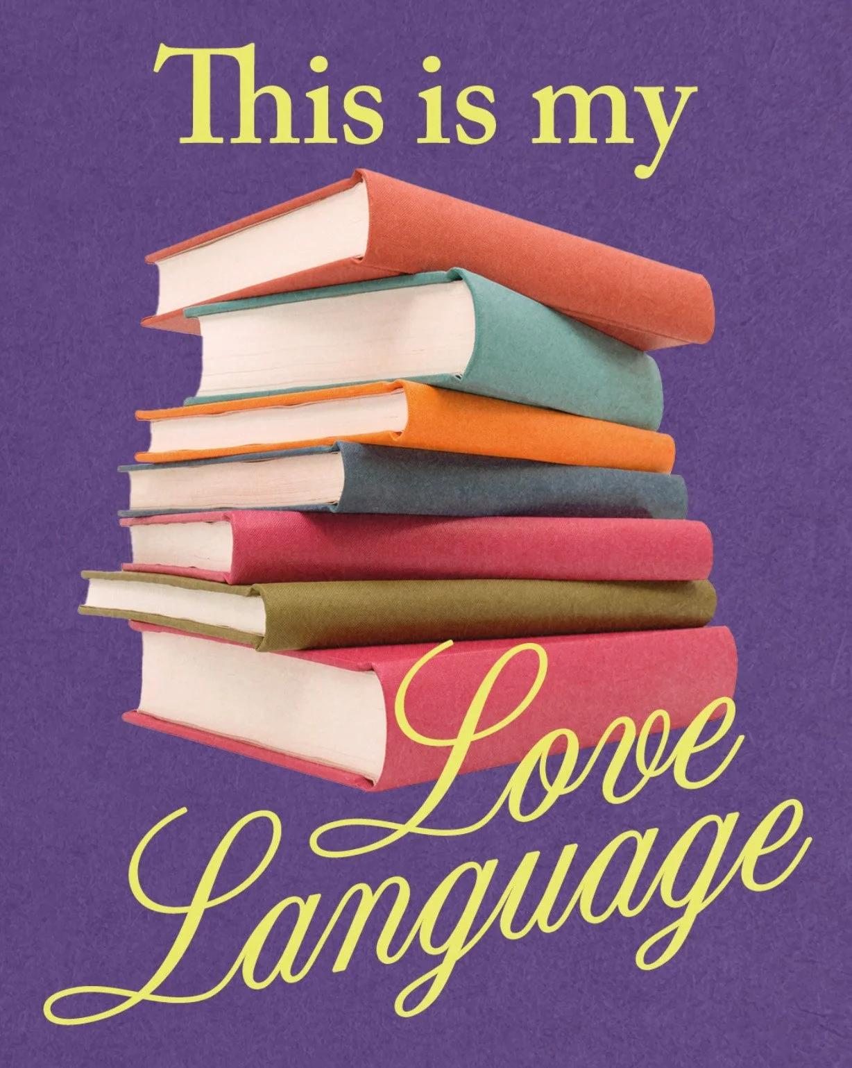
Our references moved between literary nostalgia and contemporary youth culture: classic children’s book illustration, candid photography, tactile textures, unexpected typography, and an eclectic use of color. From this foundation, we built a flexible system that could accommodate everything from new releases and reading recommendations to memes, seasonal content, and major title campaigns.

Style Guide
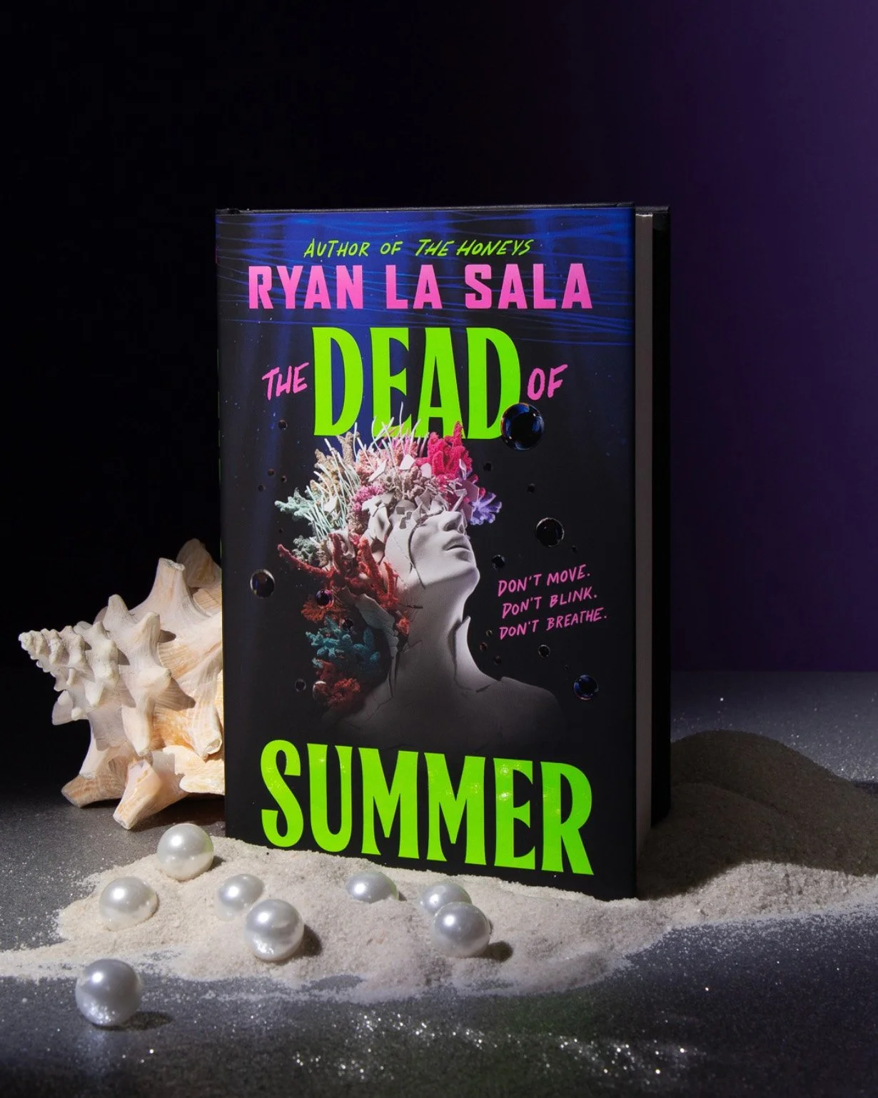
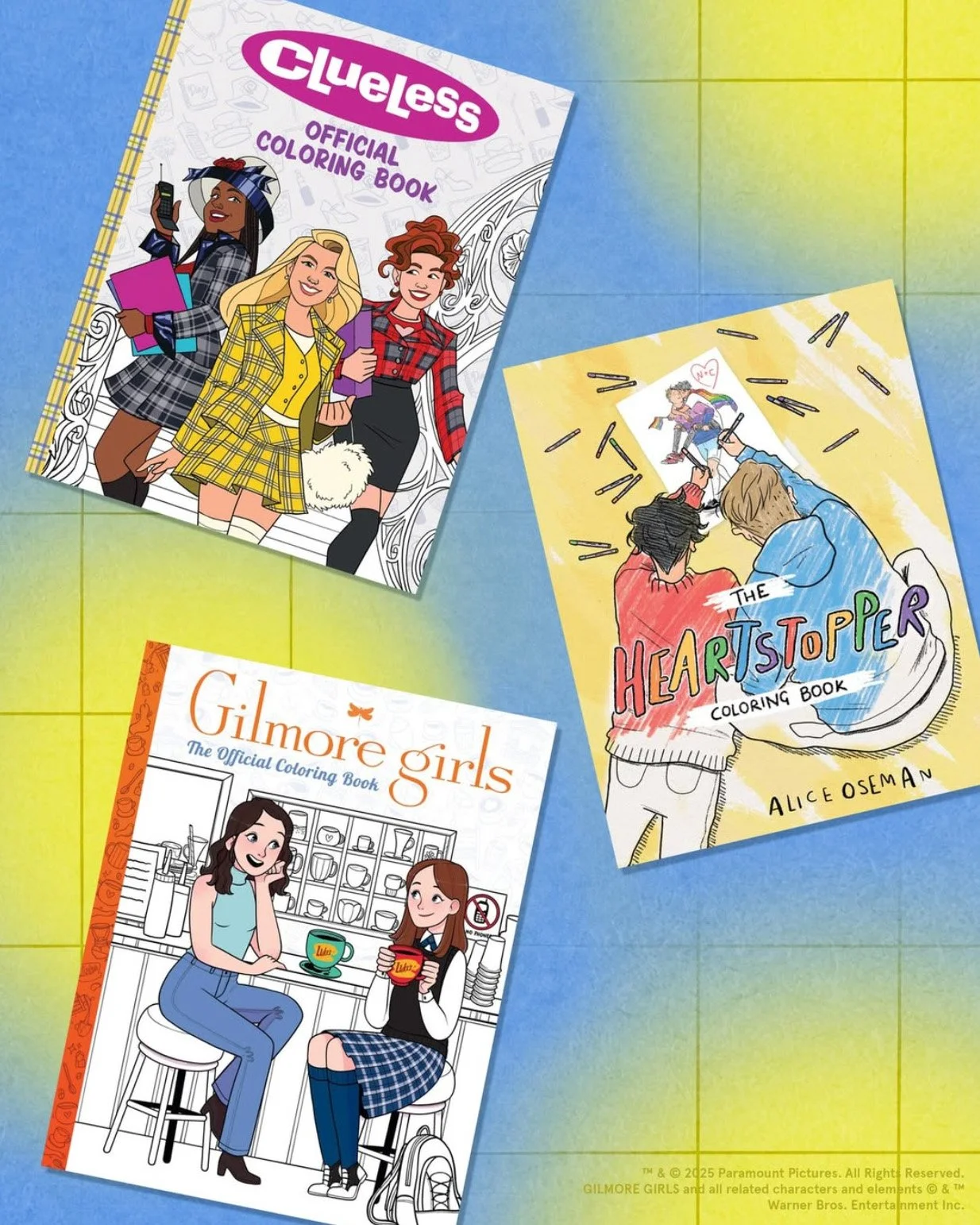
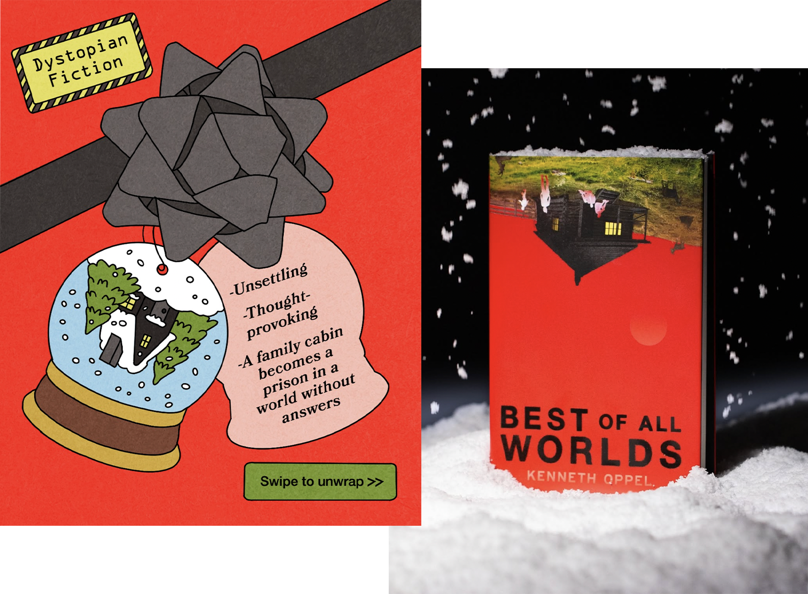
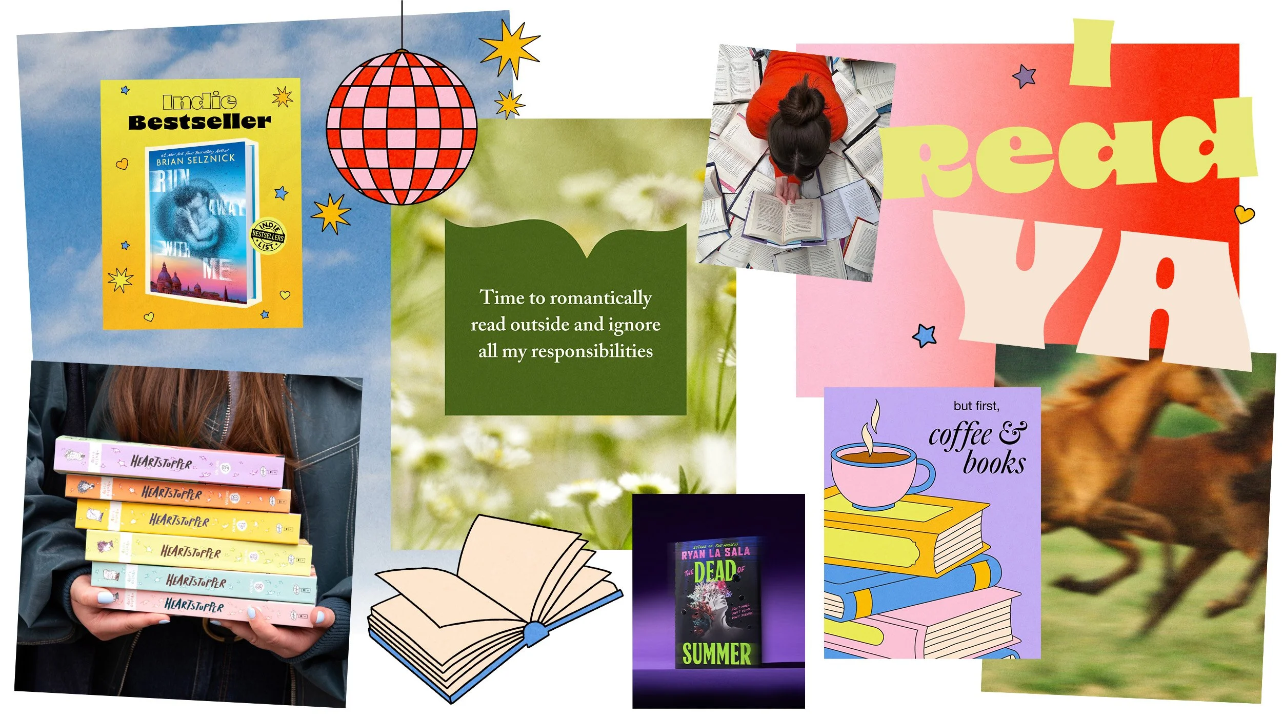
The final style guide translated the concept into a flexible toolkit for the social team, establishing a distinctive palette, typography, photographic treatments, gradients, and a modular illustration library. Rather than prescribing a single layout, the system provided a set of recognizable ingredients that could be continually recombined across content types and seasons.
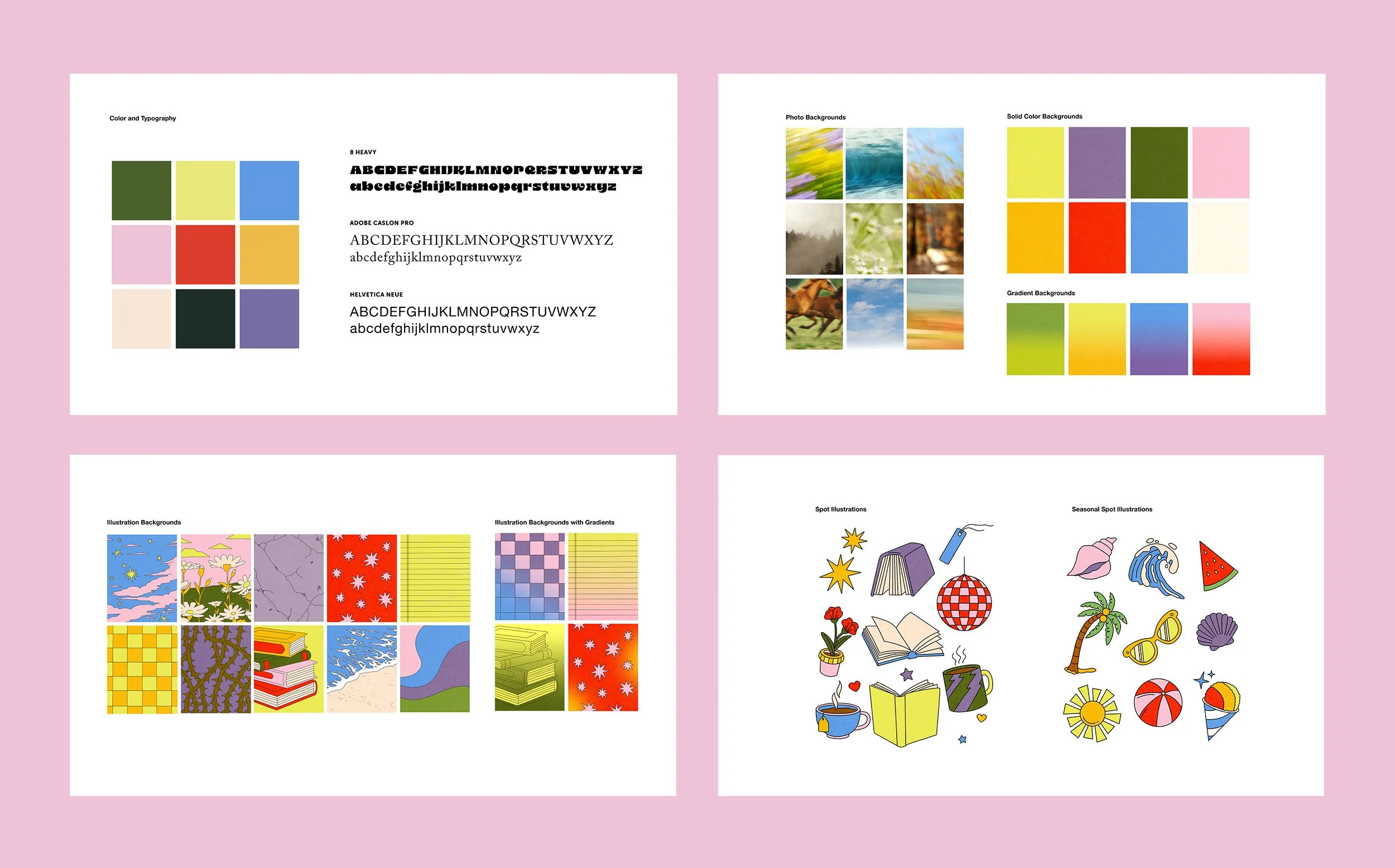
Illustration Inspiration
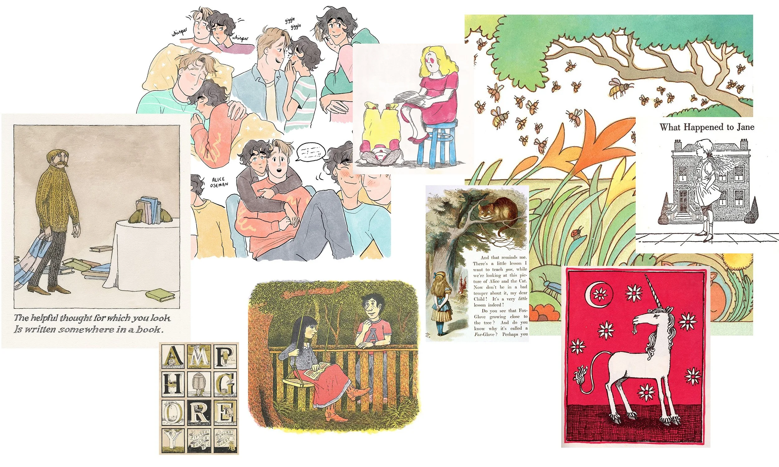
Illustration became a defining element of the identity, giving the system warmth, personality, and the versatility to support a wide range of content. We looked to the visual language of classic children’s books—particularly the work of Edward Gorey, Tomie dePaola, and Scholastic’s own Alice Oseman—for its balance of wit, charm, and timelessness.
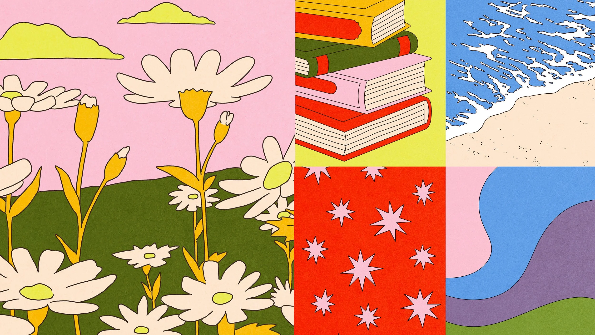
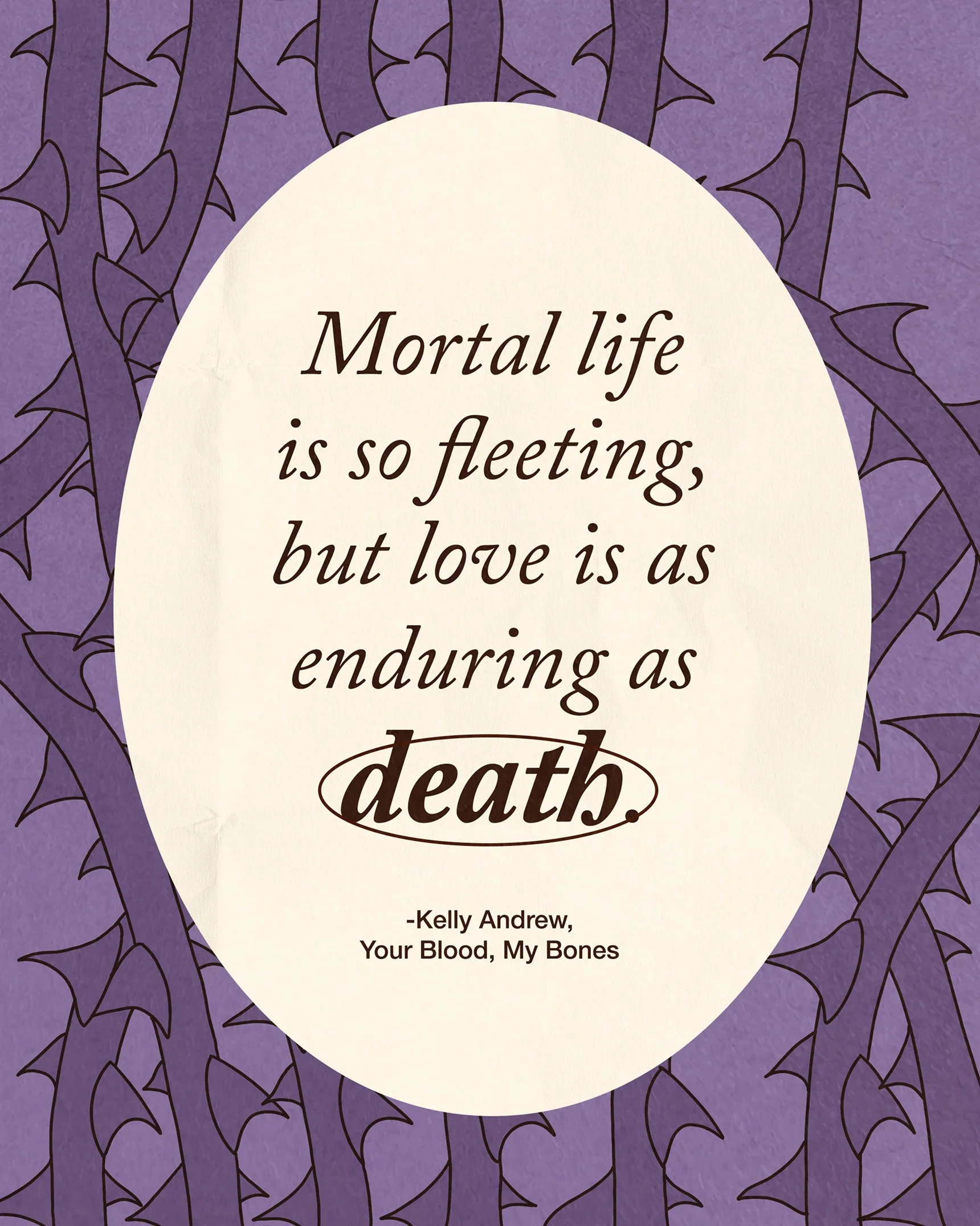
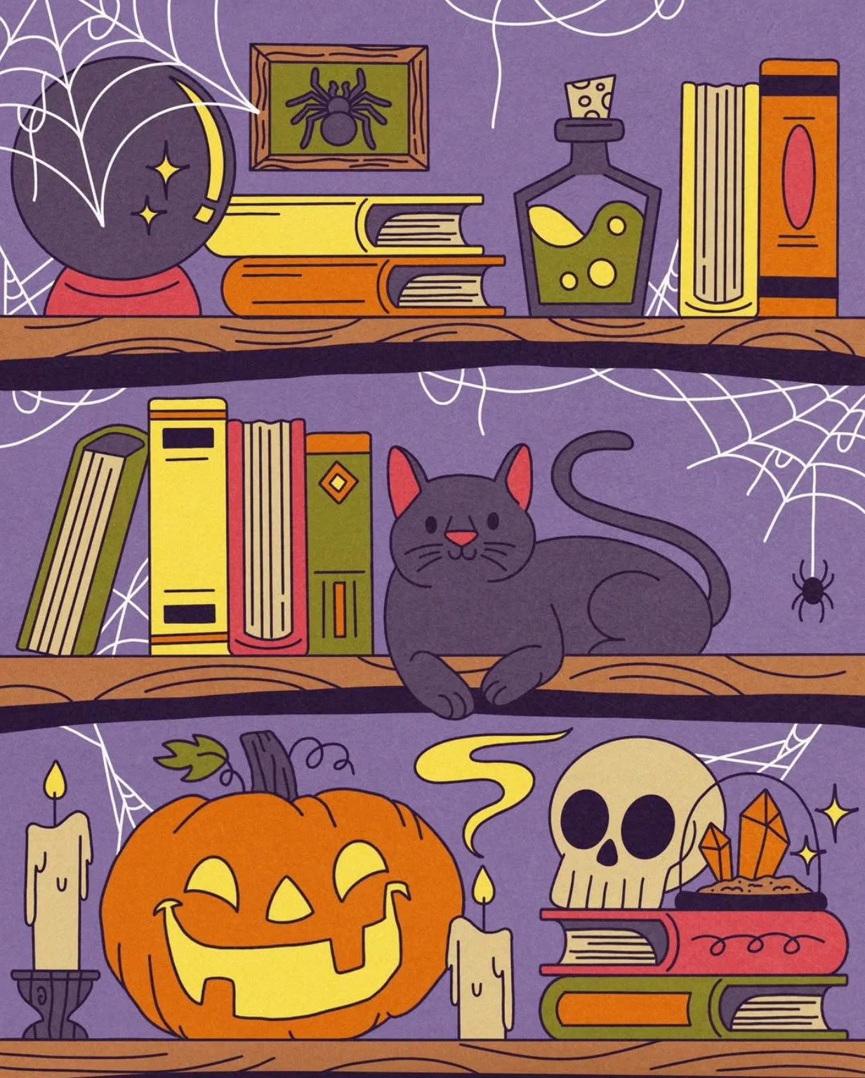
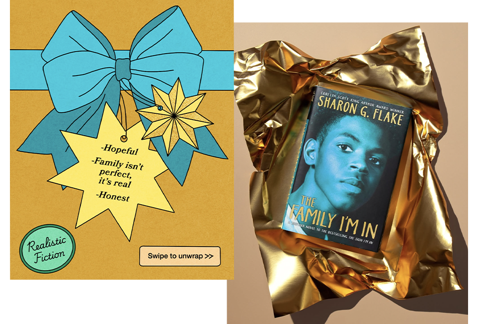
Thin outlines, soft color, and subtle texture became the foundation for a custom illustration style developed with designer and illustrator Rose Schisler. The resulting library could expand from expressive backgrounds to small graphic moments, giving the brand a distinctive visual signature across the feed.
Illustration